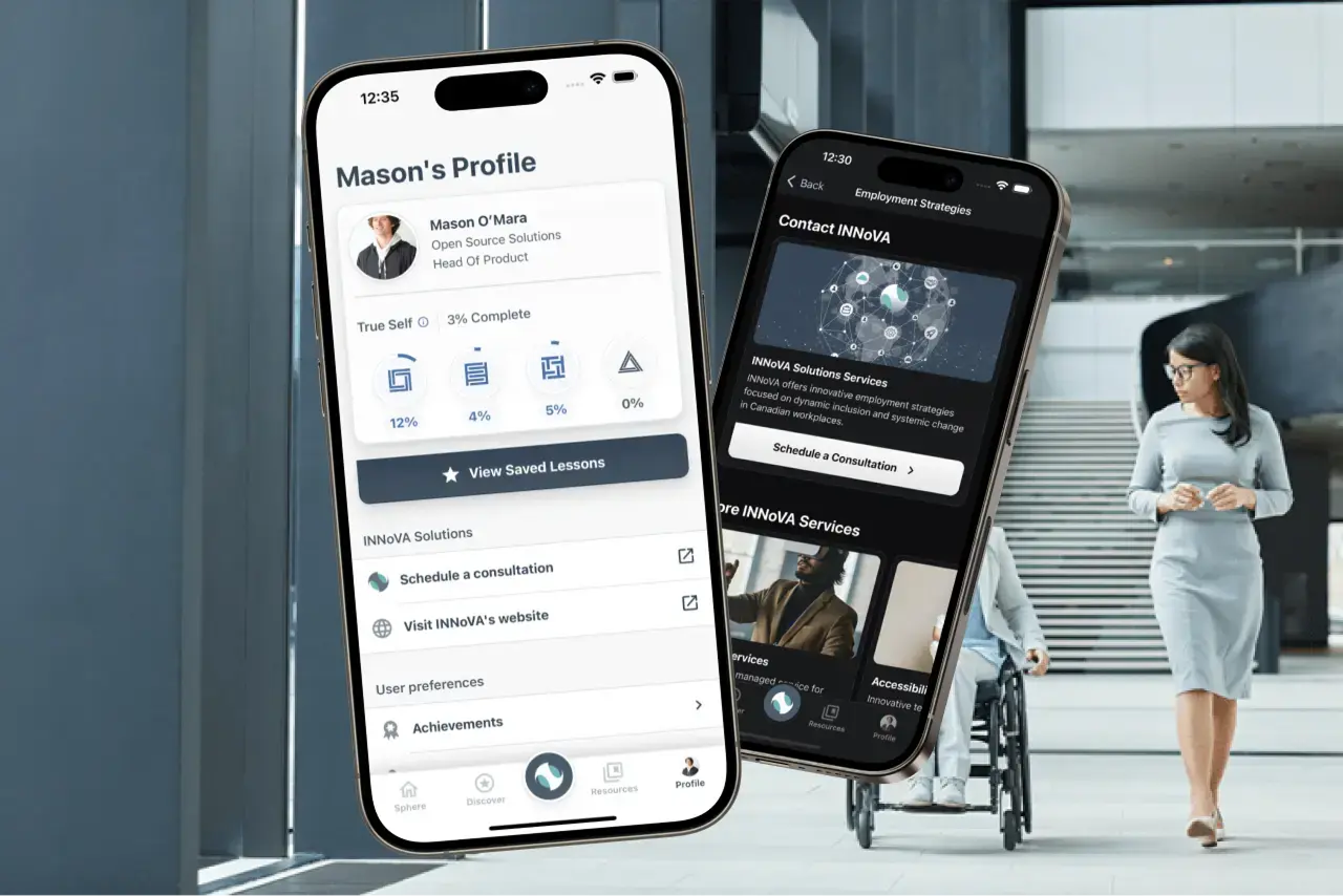
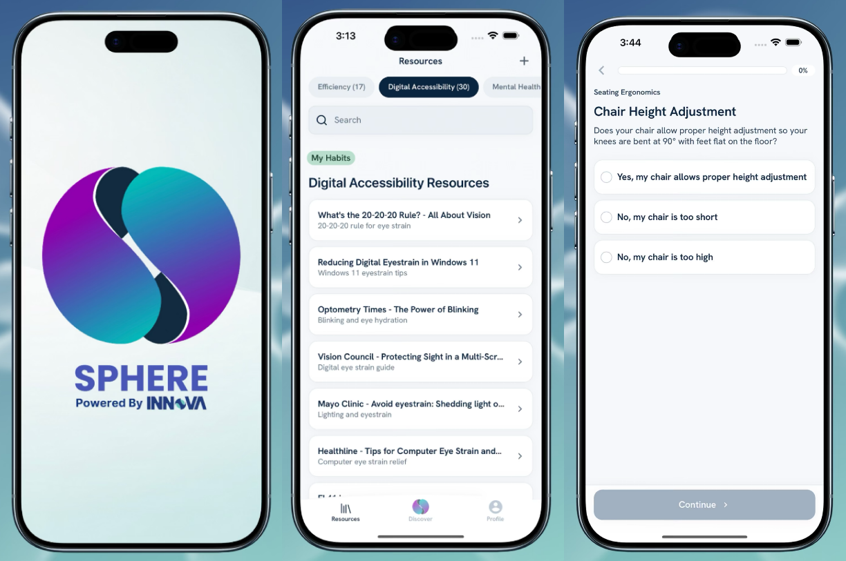
Innova Sphere
INNoVA is an accessibility consulting firm based in Toronto that needed a mobile app in two months. They had prepared four PDF flowcharts with hundreds of branching decision paths — questions about chairs, desks, monitors, standing work, driving ergonomics, screen readers, voice dictation, and ergonomic keyboards divided across arbitrary categories.
They had expert content, no technical structure. The flowcharts connected questions to answers to recommendations, but no one could query "recommendations for someone who works standing, uses a laptop, and has wrist pain."
My job was to restructure their expert knowledge into queryable data, then build an app for Android and iOS. I partnered with a native developer for the initial build, then proceeded to build and maintain it solo. The two-month project turned into 18-month engagement wth an end goal to build a services suite where employees could share their experiences and feel more connected.
The Social Model of Accessibility
INNoVA did workplace accessibility consulting, which meant helping companies accommodate employees, build accessible environments, and implement inclusive practices. They had even built a proprietary measurement tool that linked employee experience to operational performance following the social model of accessibility—the environment creates barriers, not the person.
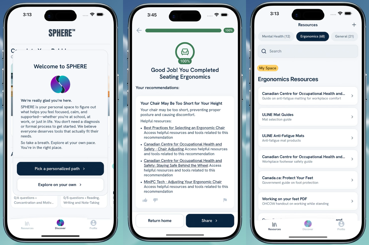
The design of the app has to reflect that philosophy. It shaped how we worded questions, presented options, and built assumptions about users. For example, every question needed "None of the above" because users shouldn't be forced into categories that don't fit. If a feature felt like a medical intake form, we cut it.
I applied WCAG AAA and built a color system using Stripe's accessible color methodology. I walked the team through why color alone fails colorblind users, and why section titles needed clear language—"ergonomic tools" and "mental wellness" rather than vague labels like "my space" and "my balance." Together we defined colors for error, warning, success, and informational states.
Mental health content required care. From meeting notes: "We are not mental health experts—need to keep what's relevant to the workplace." Some content touched crisis territory, raising liability questions. We placed crisis resources prominently and softened the recommendation language.
Tech Stack
Three technical choices defined how we built the app. We had two months to ship, so every choice had to balance speed with quality. React Native for one codebase. TypeScript for type safety across 800+ branching questions. Firebase for auth, database, and storage in one quick setup.
The tradeoff considered with Firebase was vendor lock-in. Firebase's proprietary query language and data model would make future migration expensive. For a two-month MVP with uncertain product-market fit, speed mattered more than portability.
The client's internal team led creative direction: light/dark modes, rounded shapes with shadows, and a radial menu inspired by gaming HUDs.
Later iterations added analytics tracking through Firebase and Google Analytics. We also built PDF generation so users could share their results, and video playback that streamed from Firebase Storage.
Data Architecture
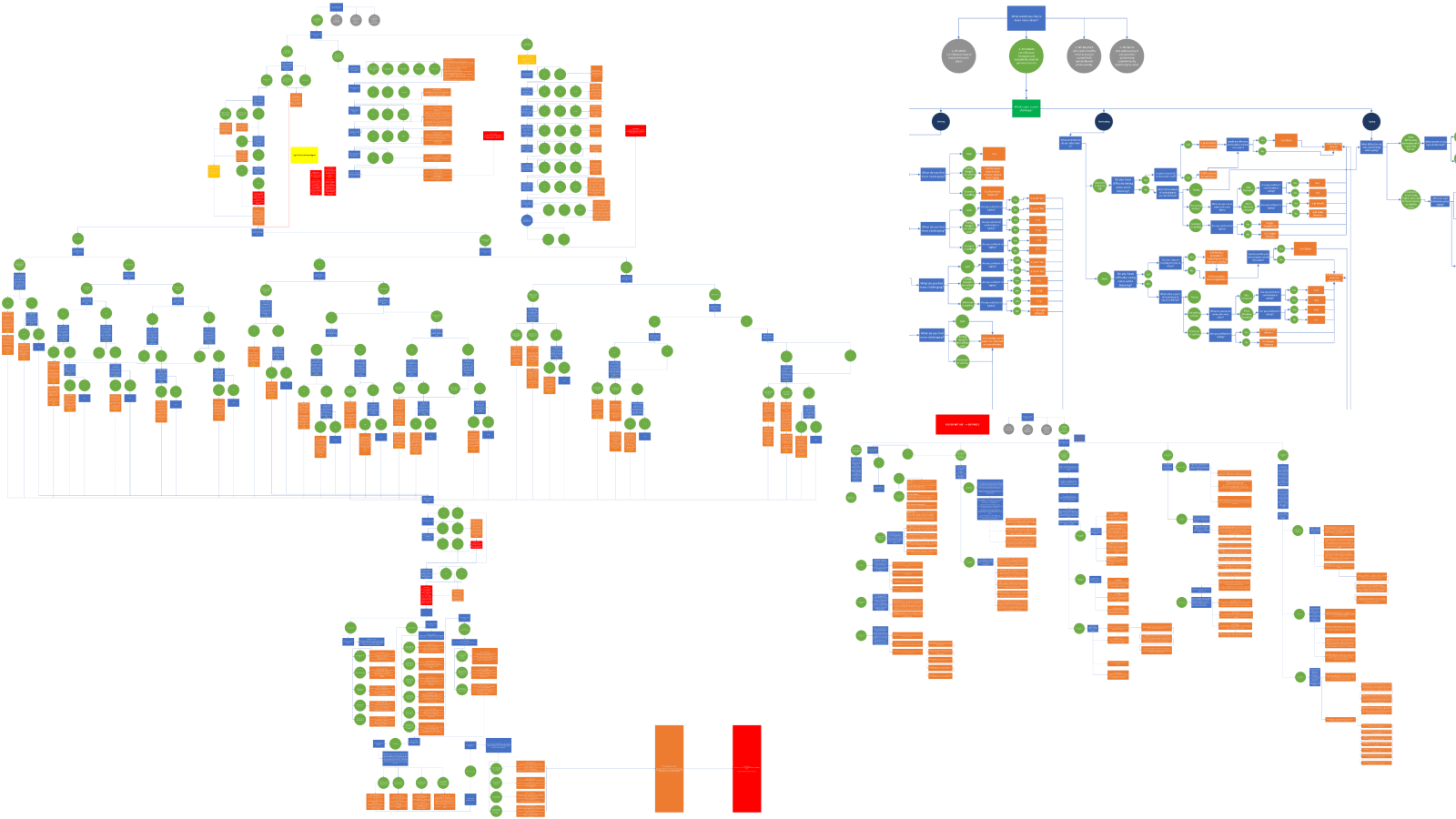
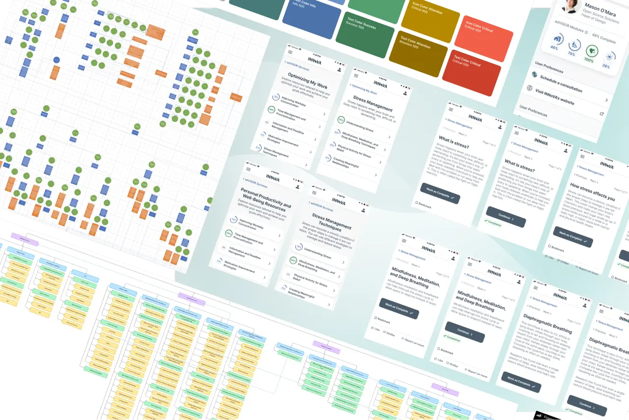
The flowcharts captured expert knowledge, but their format was the problem. Transforming unstructured expertise into structured data is often the hardest and most valuable part of a project. I converted the four PDF flowcharts into 900+ questions that could handle conditional routing, recommendations, and resources across four categories. Answers to Question A determined whether users saw Question B, skipped to D, or triggered specific recommendations.
Every record needed an explicit ID. Foreign key arrays defined relationships between records. Prerequisite fields enabled the conditional logic. The visual flowcharts became 13 workplace environments across four categories:
- Physical Ergonomics: Static standing, moving/walking, vehicle, office.
- Digital Accessibility: Input/interaction, screen positioning.
- Mental Wellness: Fatigue and wellness.
- Behavioral Change: Productivity and routines.
The content was stored as 10 interconnected tables containing over 900 records. A user selects a module, which presents questions filtered by module ID. Each answer option carries a foreign key pointing back to its parent question. When selected, options trigger recommendations through an array of recommendation IDs, and those recommendations link to resources through an array of resource IDs.
The Content Pipeline
INNoVA's content team could write recommendations but could not deploy them. Every content change funneled through me. That made me a bottleneck I had to remove.
INNoVA staff were accessibility experts, not developers, and they couldn't reliably work with JSON or databases directly. I chose TSV as the source format because it opens natively in Excel and Google Sheets. This let content experts stay in their comfort zone, editing spreadsheets rather than learning new tools. Node.js scripts then converted their TSV files into Firebase-ready JSON.
Enterprise Features
What started as a single app branched into four versions, each with its own business model:
- SPHERE Personal: Free tier. Individual users get basic access, with optional premium features behind a paywall.
- SPHERE Social: Built for community and nonprofit organizations.
- SPHERE Learning: Designed for educational institutions, "offered the most immediate growth potential."
- SPHERE Enterprise: "Primary revenue generator", Governments, banks, insurance companies. Nine government departments trialing.
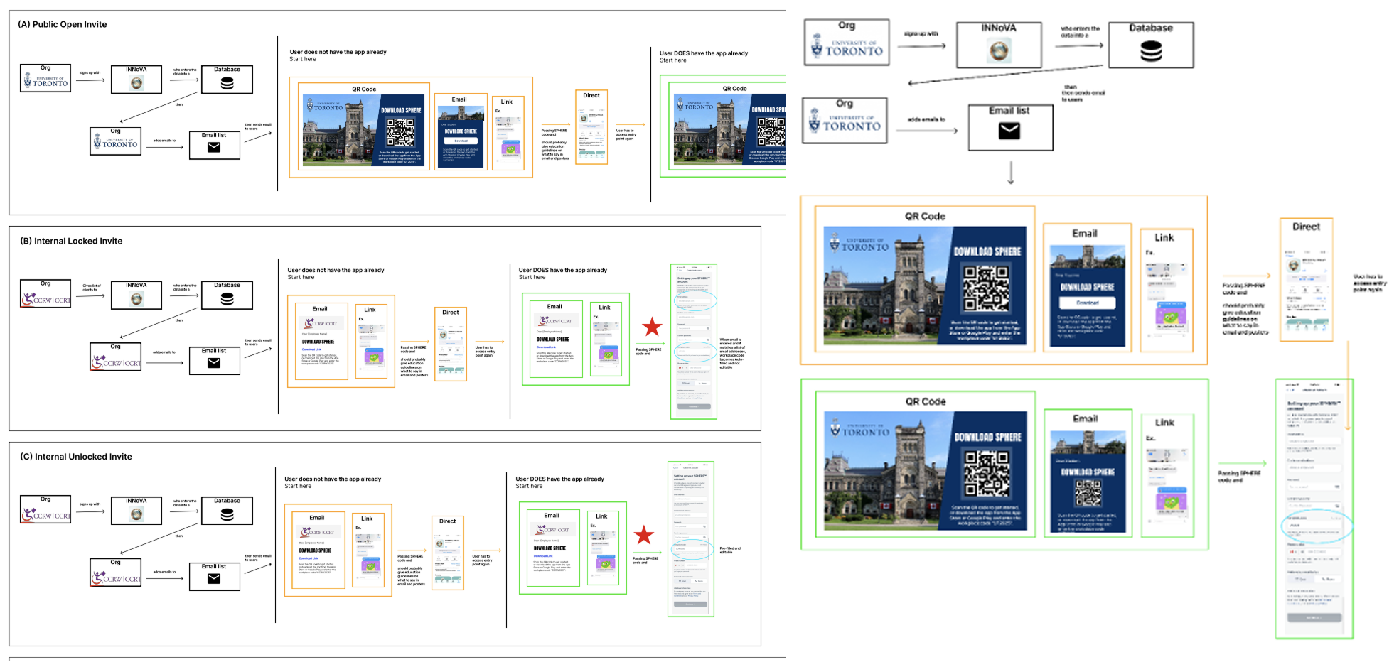
Enterprise clients needed a way to onboard employees at scale. When new users sign up, they see a choice: "I have a company code" or "Personal use." If they enter a valid code, they get linked to their organization. Their employer can then see aggregate analytics, and the employee receives company-specific recommendations. The signup flow had to handle five distinct paths, each with specific error messaging.
Gamification Strategy
In February 2025, INNoVA flew me to Toronto for a working session and client roundtable. For months I'd built on secondhand feedback. Now I was in a room with users.
The difference was immediate. Direct questions got direct answers. Features I'd assumed were working weren't. Features I'd dismissed as edge cases were daily pain points. Client priorities and management priorities had drifted. From this I was able to redefine the user types and produce three deliverables focused on game elements. These became the strategic foundation for the next six months:
The first document, the "Gamification Report", analyzed engagement frameworks using Yu-Kai Chou's Octalysis system. The key insight was "Game elements alone provide only momentary enjoyment. Without meaningful structure, badges feel empty."
Before this framework, every stakeholder had their own pet feature. Marketing wanted viral mechanics. The accessibility team wanted educational content. Management wanted "engagement" without defining it. Octalysis gave us a shared vocabulary to map every proposed feature to psychological drivers. Saying "this feature hits core drives 2 and 4" opened a different conversation than "I think users would like this."
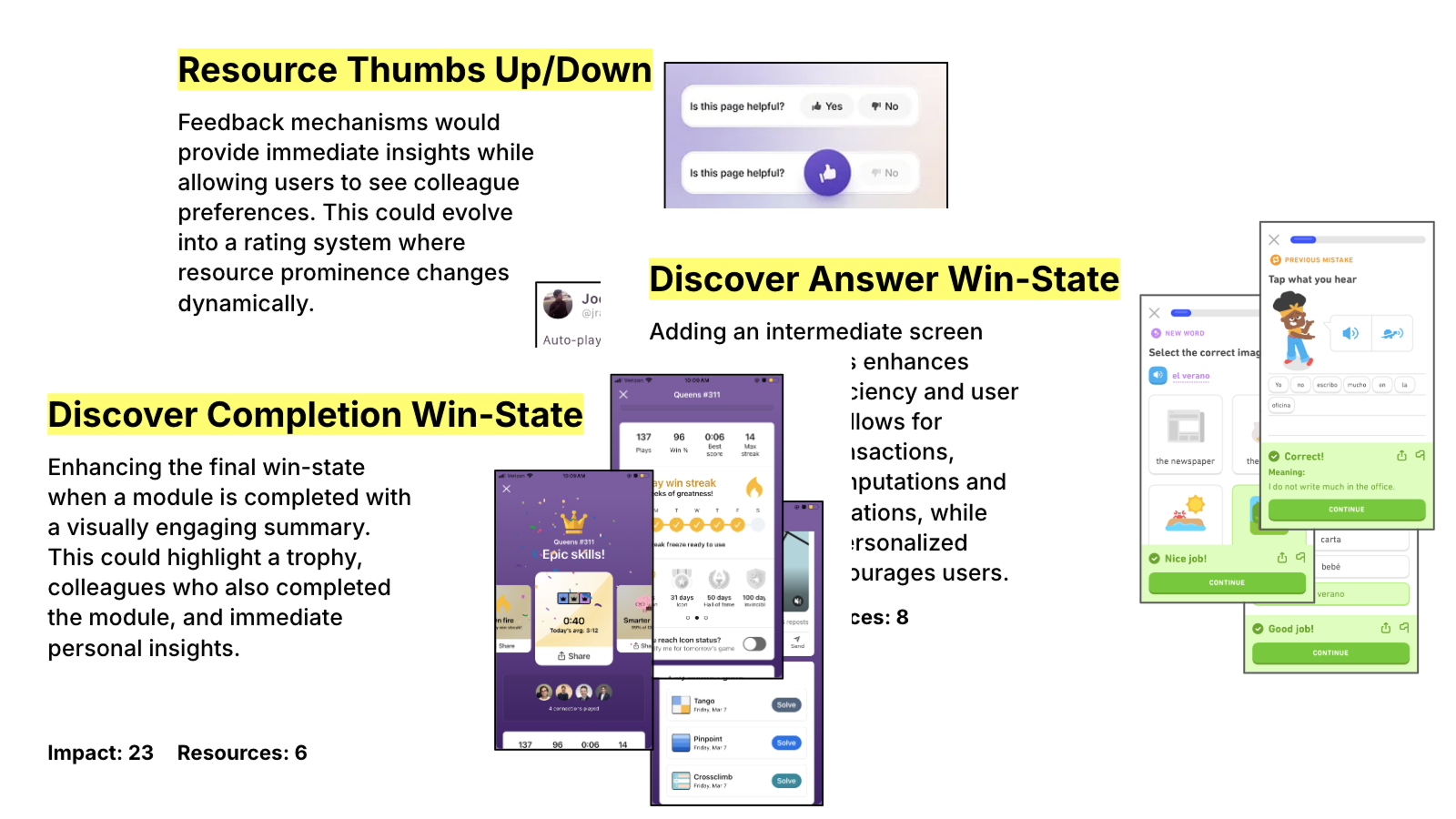
The second document, the "Ideas Deck," translated strategy into a 49-page stakeholder presentation. I drew references from Duolingo's onboarding and feedback systems, LinkedIn Games' completion screens, Spotify's smart recommendations, Reddit's voting mechanics, 16 Personalities' profile visualization, and Pokemon Cards' trophy case approach.
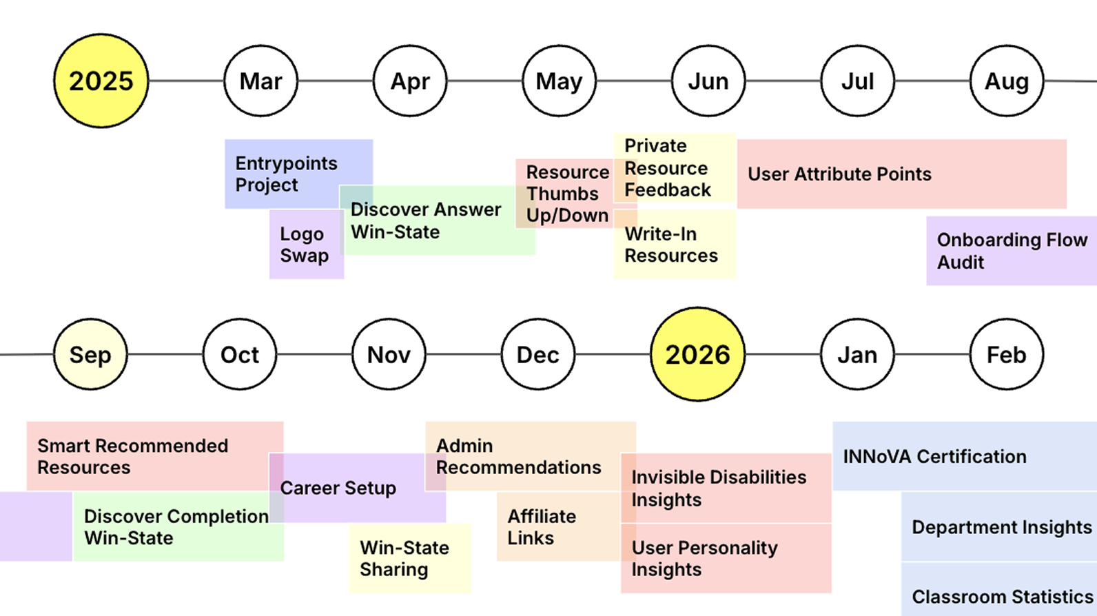
The third document, the "Feature List," captured prioritization data. We brainstormed 38 distinct features, from basic badge systems to complex mentorship matching. The Impact/Resources matrix forced explicit tradeoffs:
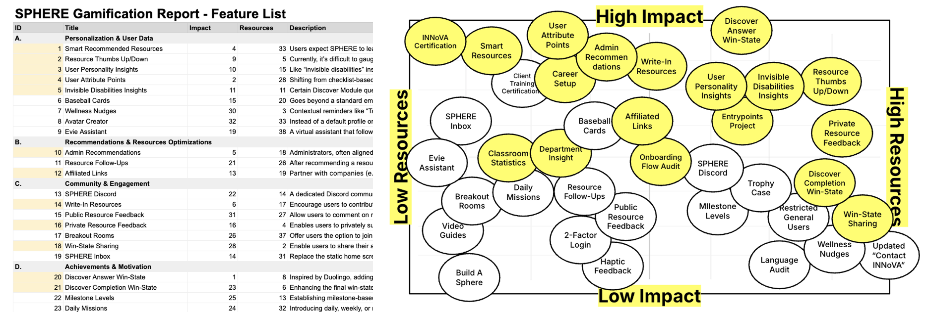
We scored all 38 features From those 38, we selected 18 for a 12-month roadmap. We explicitly deprioritized features with low impact and high resource cost.
The Attribute System
The existing system produced over fifty isolated logic checks per user, generating profiles like: "Yes to Q173, No to Q194, Yes to Q204, No to Q211..." repeated forty or more times. This approach didn't scale. Every new recommendation required manually mapping every answer combination.
I proposed replacing this fragmented logic with six attributes: Compliance, Communication, Awareness, Engagement, Inclusivity, Proficiency. Rather than collecting binary flags, we would score users on a spectrum. Rather than mapping recommendations to specific answer paths, we would map them against attribute combinations.
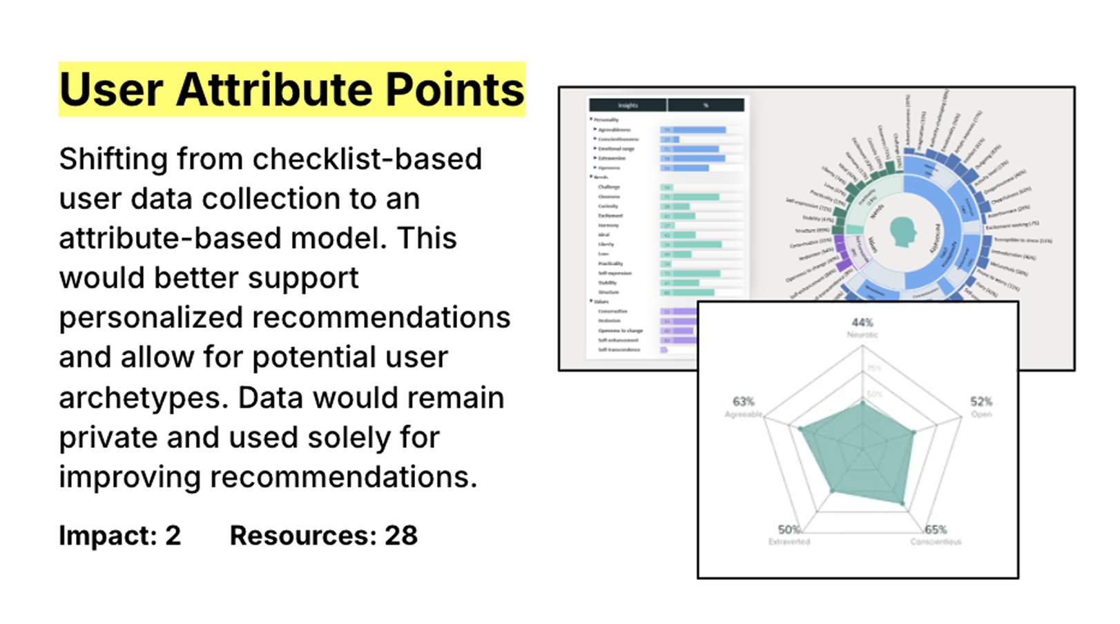
This reduced fifty puzzle pieces to six clear signals. Attributes would reveal patterns across users, and the system would become far easier to evolve as the user base grew.
We designed this system but did not fully implement it during my engagement. The architecture was defined; the execution proved too dependent upon content resources.
The Bubbles Interface
Floating bubbles representing topics. Tap once to select. Tap again for priority. Third tap removes. Inspired by Headway and Deepstash.
React Native Reanimated for bounce easing. Playful without being gamified.
Launch and Iteration
Design and development ran through May and June 2024, and we launched at the end of June. Both the App Store and Google Play Store accepted the app. Users could download it, create accounts, answer questions, and receive recommendations. It shipped and the INNoVA team was ecstatic.
The MVP hypothesized that users would complete 800+ question assessments, that personalized recommendations would create value, and that a non-clinical approach to accessibility would resonate. INNoVA tested those hypotheses through demos and conversations: old-school validation with existing clients, prospective partners, and government contacts.
The product evolved through multiple post-launch versions. The first stable release addressed legal policy compliance for Google Play. We added a user feedback system for liking and disliking resources, then haptic feedback, brand fonts, and sharing functionality. A major update brought video integration, Firebase Storage URL conversion, and module-specific resource overlays. The final update introduced the Bubbles feature for tag-based module navigation alongside enhanced UI components.
What Shipped
What began as a two-month MVP became an 18-month partnership. The product now runs on a content architecture I built from scratch: 979 structured records across 10 interconnected tables. An automated pipeline converts TSV files to Firebase-ready JSON, so INNoVA's content team can update recommendations without touching code. The system powers 13 workplace environment modules spanning physical ergonomics, digital accessibility, and mental wellness. Each module draws from 144 personalized recommendations and connects users to 148 external tools and resources.

The product grew well beyond its original assessment flow. Bubbles gives users a playful way to choose topics that matter to them, replacing rigid survey logic with something more human. Organizations can onboard employees through company codes and manage them through an admin console. QR codes and partner links open new pathways into the experience. I documented every data relationship and content structure so the system can evolve without me.
The Toronto trip produced deliverables that outlast the code itself. A gamification report maps features to psychological drivers. An ideas deck translates strategy into language stakeholders can act on. A prioritization matrix ranked 38 features for a 12-month roadmap. The attribute system design sits ready for implementation once INNoVA's content team has bandwidth to populate it.